Portfolio site — Content-Driven Astro Workspace
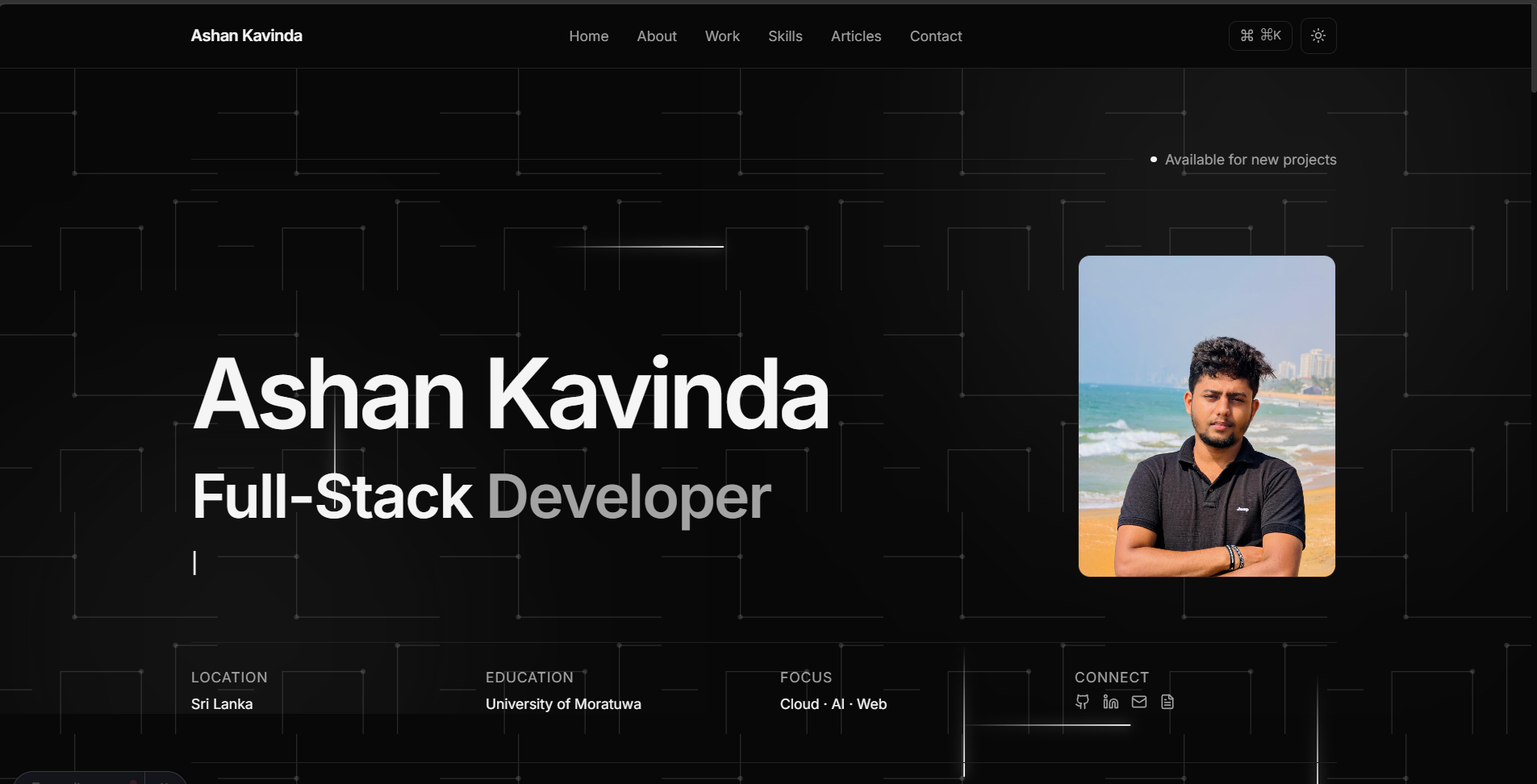
A statically generated personal portfolio and case-study platform built with Astro 5, React 19 islands, MDX content collections, and a zero-saturation dual-theme design system.
Project Overview
This site is the portfolio you are reading right now — a statically generated personal workspace that doubles as a publishing system for engineering case studies. It was built to treat project write-ups as structured content rather than hand-maintained markup, and to ship as close to zero client-side JavaScript as an interactive site reasonably can.
Problem Statement
Most portfolio templates hardcode their content into the page: adding a project means editing JSX, duplicating card markup, and manually wiring a new route. The heavier ones ship an entire React runtime to render what is, in practice, static text. This project set out to invert both problems — make content the input to the site rather than part of its source, and pay for JavaScript only where a feature genuinely needs it.
Project Goals
- Content as Data: Every project, article, and education entry lives as an MDX file validated by a Zod schema, so a malformed entry fails the build rather than the page.
- Zero-JS Baseline: Static HTML by default, with React hydrated only for the handful of components that are actually interactive.
- Hueless Design System: A single neutral ramp at zero saturation, with two themes that are true inversions of each other rather than independently tuned palettes.
- Motion That Degrades: A declarative scroll-reveal system that respects
prefers-reduced-motionand fails visible rather than blank. - Hands-Off Deployment: A push to
mainbuilds and publishes the site with no manual step.
System Architecture
The site is a static build with selectively hydrated interactive islands:
- Framework: Astro 5 static site generation, with
@astrojs/reactsupplying hydrated islands and@astrojs/mdxhandling long-form content. - Content Layer: Three collections —
projects,blog, andexperience— each defined by a Zod schema insrc/content.config.ts, which types the frontmatter and validates it at build time. - Design System: Tailwind CSS mapped onto HSL channel tokens, so every colour composes with Tailwind’s
<alpha-value>modifiers, and both themes swap by toggling a singledarkclass on the document root. - Motion Layer: Motion One’s vanilla
animateandinViewdrive page-level reveals with no React island attached;motion/reactis reserved for widgets whose animation follows component state. - Delivery: A GitHub Actions workflow builds the site on every push to
mainand publishes the artifact to GitHub Pages, with@astrojs/sitemapgenerating the sitemap during the build.
Key Features
- MDX-Driven Case Studies: Dropping a
.mdxfile intosrc/content/projects/generates its detail route, its card in the filtered projects grid, and its homepage placement automatically — no component edits required. - Command Palette: A
Cmd+K/Ctrl+Kmodal with live query filtering and full arrow-key and Enter navigation for keyboard-only traversal of the site. - Monochrome Dual Theme: A zero-saturation palette in which the accent token is the foreground colour, so a primary button renders as the page inverted rather than as a coloured fill.
- Declarative Reveal System: Sections animate in via
data-revealanddata-staggerattributes, letting an author opt any element into the motion system without importing anything. - Spam-Resistant Contact Form: A Web3Forms-backed submission flow with a hidden honeypot field that rejects bot submissions without a CAPTCHA.
- Production SEO: Generated sitemap,
schema.org/PersonJSON-LD structured data, Open Graph previews,robots.txt, and a custom 404 page.
Challenges & Solutions
Scroll Reveals Versus Client-Side Re-Rendering
- Challenge: The reveal system hides elements with CSS and animates them in after a single DOM scan at load. The projects grid re-renders on the client whenever a category filter changes, so cards mounted after that scan inherited the hidden starting state with nothing left to reveal them — a grid of invisible cards.
- Solution: Scoped the reveal attributes to server-rendered markup and deliberately opted the filtered grid out, so client-mounted cards render at full opacity instead of waiting for an observer that had already run.
Theme and Motion Flash Before First Paint
- Challenge: Reading the stored theme after hydration meant a visible flash of the wrong theme, and gating the reveal animations in the same pass risked leaving content permanently hidden if the animation bundle ever failed to load.
- Solution: Moved both decisions into a small inline script that runs in
<head>before first paint, applying the theme class and enabling the animation gate only when motion is permitted — backed by aloadevent failsafe that strips the gate if the animation module never reported ready.
Building Hierarchy Without Hue
- Challenge: With saturation fixed at zero across the entire palette, the usual tools for signalling emphasis, interaction state, and depth were unavailable.
- Solution: Redistributed that work across a four-step border ramp, a shadow alpha multiplier tuned per theme, and the monospace typeface for metadata — then contrast-tested the result rather than trusting the reference values, which is how muted text landed at 42% lightness for a 4.59:1 ratio on the darkest light-mode surface instead of the 45% that would have failed AA.
Lessons Learned
- Designing a colour system with no hue to spend, which forces hierarchy into borders, typography, and elevation and makes every contrast decision explicit.
- Deciding per component, in an islands architecture, whether animation belongs in a vanilla Motion One call or in a hydrated React island.
- Modelling site content as build-time-validated collections so that broken frontmatter surfaces as a build failure instead of a runtime blank.